Mizu Restaurant Branding

Role
Brand Designer
Timeline
3 weeks
Tools
Illustrator
Photoshop
InDesign
Deliverables
Logo
Emblem
Packaging
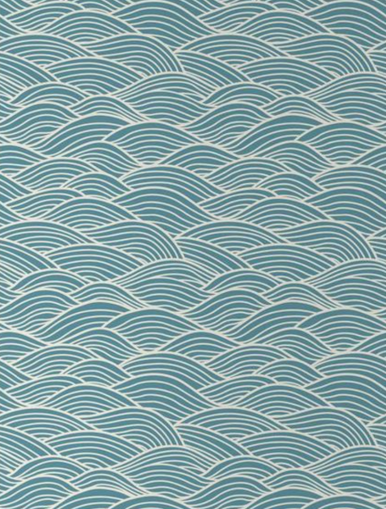
Signature Pattern
Menu
Signage
Design Principles
Balance
Inspired by the fluidity and calmness of water, the layouts use generous white space and simple compositions.
Authenticity
Rather than relying on stereotypical Japanese imagery, the identity communicates its influence through typography, colour, and subtle graphic details.
Versatility
The visual system was designed to work consistently across packaging, menus, digital interfaces, and environmental applications.
The Challenge
Design a visual identity for Mizu, a contemporary Japanese restaurant that balances traditional influences with a modern dining experience. The brand needed to stand out in a competitive market while avoiding common visual clichés associated with Japanese restaurants, creating an identity that felt refined, memorable, and adaptable across both print and digital touchpoints.
The Goal
Develop a cohesive brand identity that appeals to young professionals and food enthusiasts seeking a high-quality dining experience. The identity needed to communicate elegance, authenticity, and warmth while remaining flexible across menus, packaging, signage, and social media.
The Solution
I created a minimalist visual identity inspired by the meaning of Mizu ("water" in Japanese), using clean typography, a restrained colour palette, and subtle graphic elements to evoke balance and calm. The identity was designed as a flexible system that extends consistently across menus, packaging, digital interfaces, and environmental graphics, creating a recognizable and cohesive customer experience.
Reflection
What worked
The system is cohesive and scalable across print and digital applications. A restrained visual language and consistent grid helped reinforce clarity and brand recognition. Early exploration of multiple directions supported a more focused final outcome.
Challenges
Avoiding common visual clichés while maintaining cultural sensitivity was a key challenge. Balancing minimalism with personality also required careful refinement to ensure clarity without losing character.
If this were a real client
I would begin with deeper audience and stakeholder research to better define positioning and tone of voice. I would also expand the system to include social media templates, uniforms, and indoor signage.
Design Process
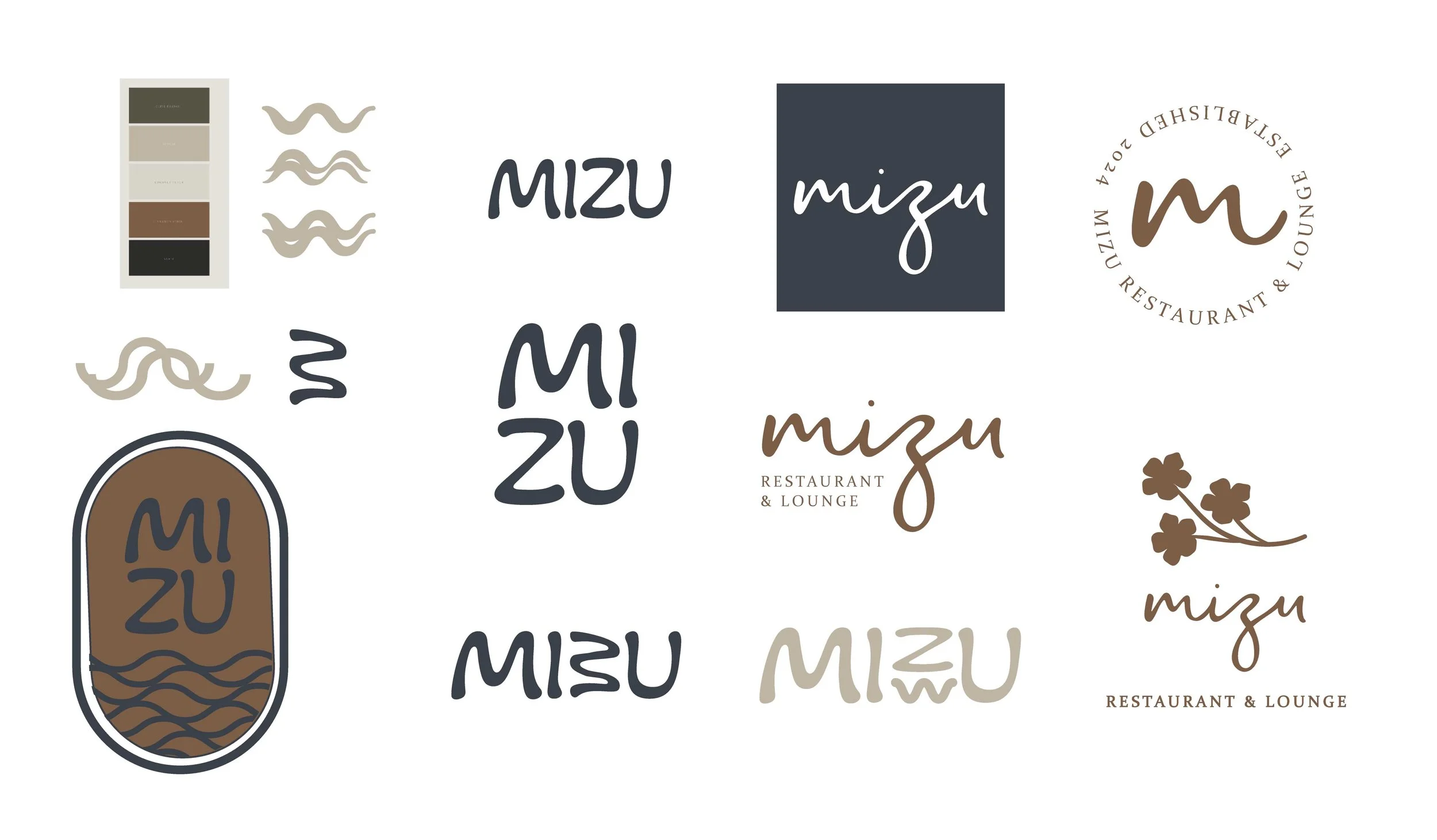
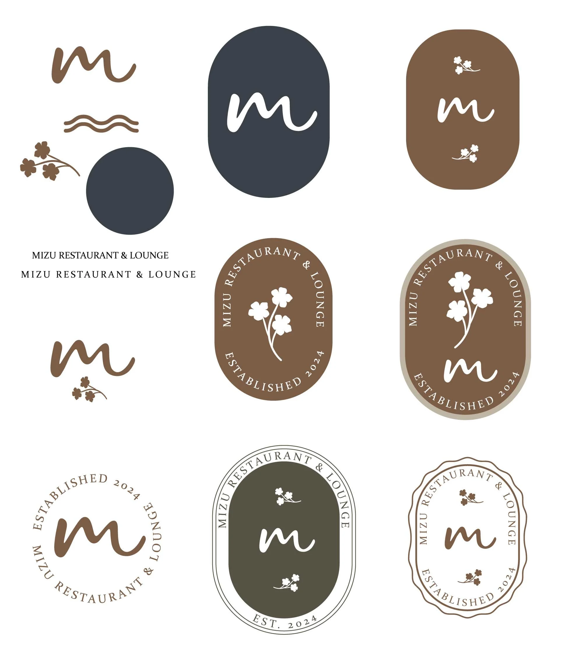
Starting with a defined colour palette and overall brand direction, I developed and refined several logo and emblem concepts. Exploring multiple iterations allowed me to evaluate different approaches before selecting the final identity. Below are screenshots of my Illustrator artboards (slightly cleaned up :).