SFU Course Experience Surveys Campaign
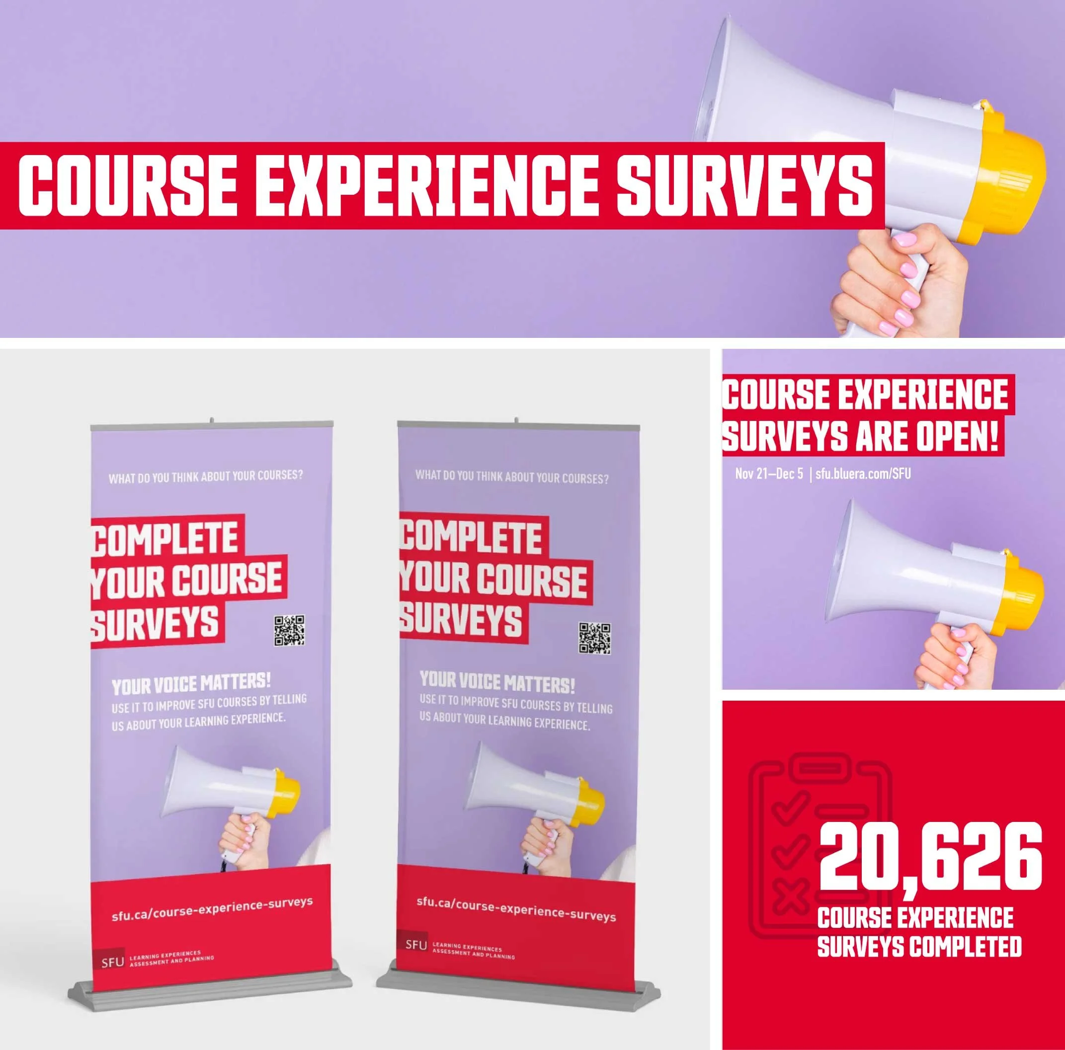
Role
Communications Designer
Project Type
Integrated awareness campaign
Date
2022–2023
Tools
Illustrator
Photoshop
InDesign
Deliverables
Campaign concept
Copy
Roll-up banners
Posters
Social media graphics
Digital signage
Web banners
Print collateral
Infographics
Design Principles
Brand Consistency
All campaign materials were designed in accordance with SFU's brand guidelines, ensuring a cohesive visual identity across print and digital touchpoints while maintaining institutional recognition and trust.
Student-Centred Design
The campaign prioritized clarity and immediacy, recognizing that students often have only a few seconds to engage with promotional materials while moving between classes. Every design decision focused on making participation feel simple, visible, and actionable.
Bold Communication
Large-scale typography, strong colour contrast, and concise messaging were used to capture students' attention in busy campus environments and communicate the call to action at a glance.
Scalable System
The visual system was designed to adapt seamlessly across multiple formats, including posters, roll-up banners, digital signage, social media, and web graphics, while maintaining consistency and flexibility.
Accessible Hierarchy
Clear information hierarchy and strategic placement of key elements, such as the survey deadline, QR code, and call to action, helped ensure the campaign remained easy to scan and understand across different viewing distances and devices.
The Challenge
Increase student participation in SFU's Course Experience Surveys by creating a campaign that would capture attention in a busy campus environment and encourage students to complete the surveys before the deadline. The campaign needed to communicate a clear call to action while remaining consistent across print and digital formats.
The Goal
Develop a bold, cohesive campaign that raised awareness and motivated students to participate. The visual system needed to be adaptable across multiple touchpoints, including campus signage, digital screens, social media, and promotional materials, while remaining recognizable and accessible throughout the campaign.
The Solution
I designed an integrated campaign built around SFU’s bold typography, high-contrast colour, and a simple visual language that quickly communicated the message. A consistent design system was applied across banners, posters, digital graphics, and social media assets to create a unified presence across campus and reinforce the campaign throughout the survey period. After the surveys closed, I created an infographic and supporting social media graphics to share key findings and demonstrate how student feedback is used to shape improvements at SFU. By closing the feedback loop, these materials reinforced the value of participation and encouraged future students to complete the surveys.
Reflection
What worked
A consistent visual system made the campaign instantly recognizable across multiple formats. Bold typography, strong colour contrast, and a clear call to action helped communicate the message quickly in high-traffic campus spaces. Designing the campaign as a flexible system also allowed it to be adapted easily for a variety of print and digital applications.
Challenges
One of the biggest challenges was creating materials that could capture students' attention within only a few seconds while walking between classes. Balancing visual impact with clear information hierarchy, while staying true to SFU’s established branding required careful refinement to ensure the key message remained easy to understand across different formats and viewing distances.
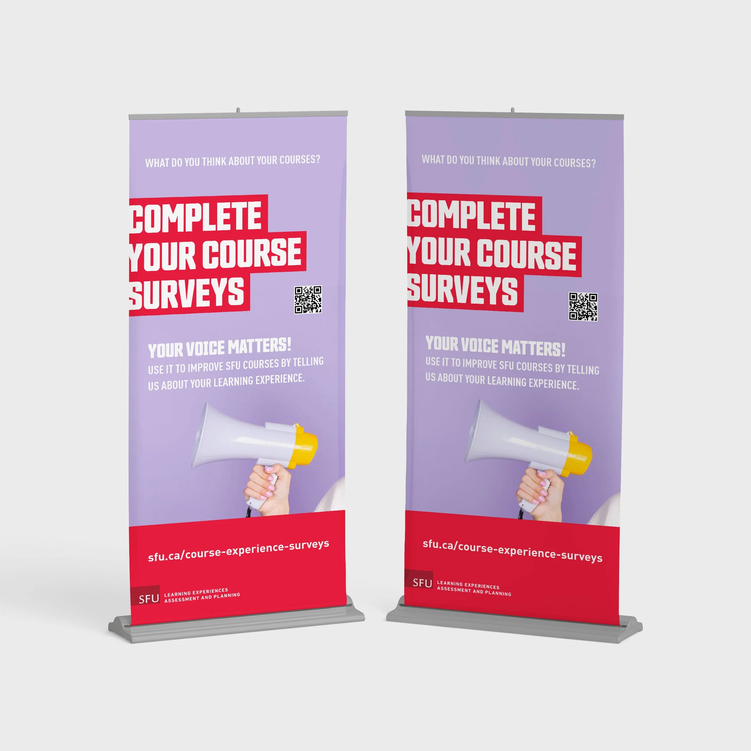
Roll up banners
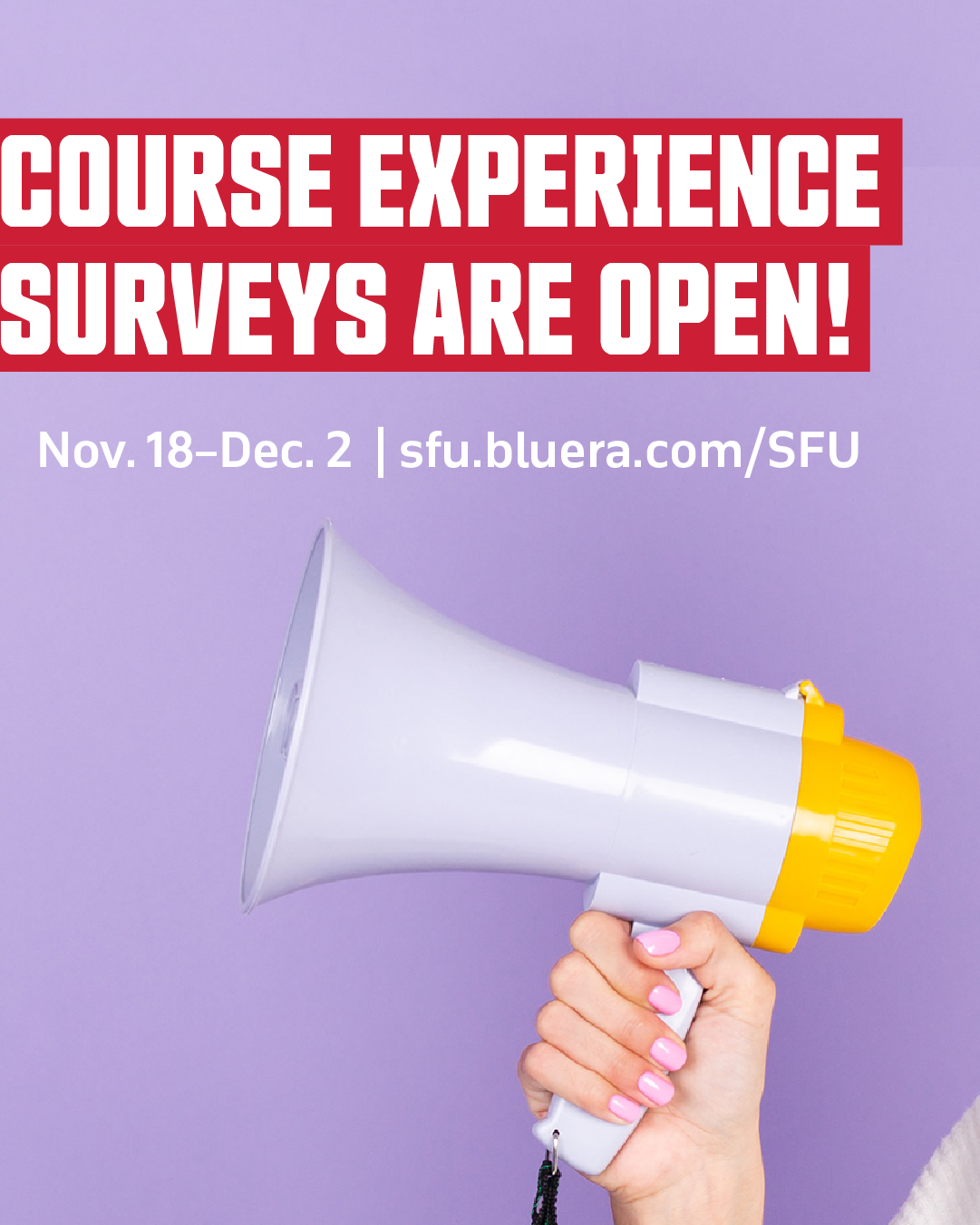
Instagram post
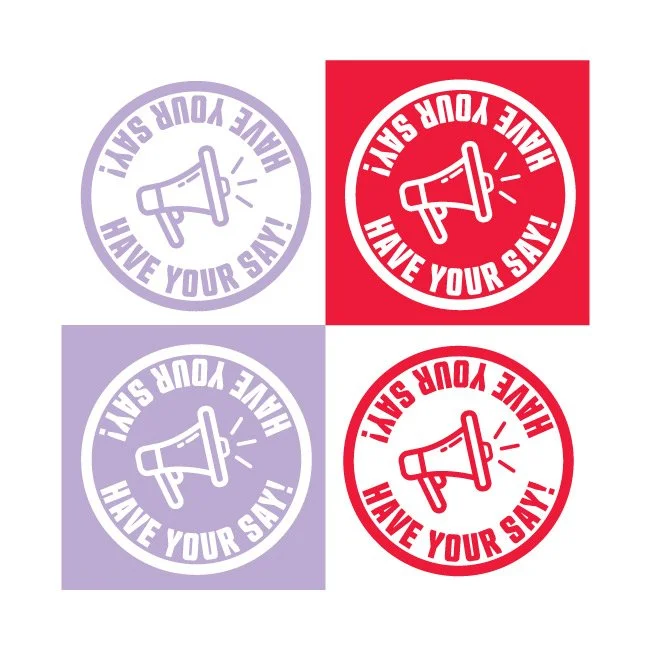
Stickers
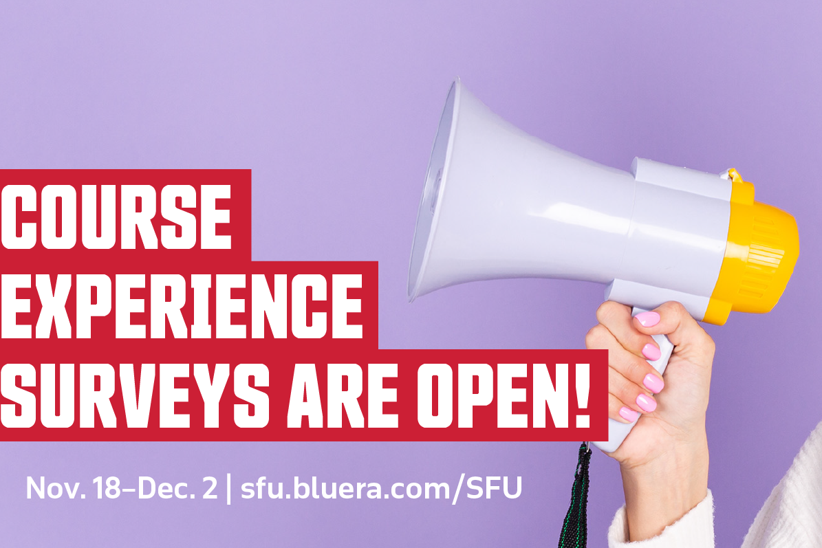
X post

Instagram story

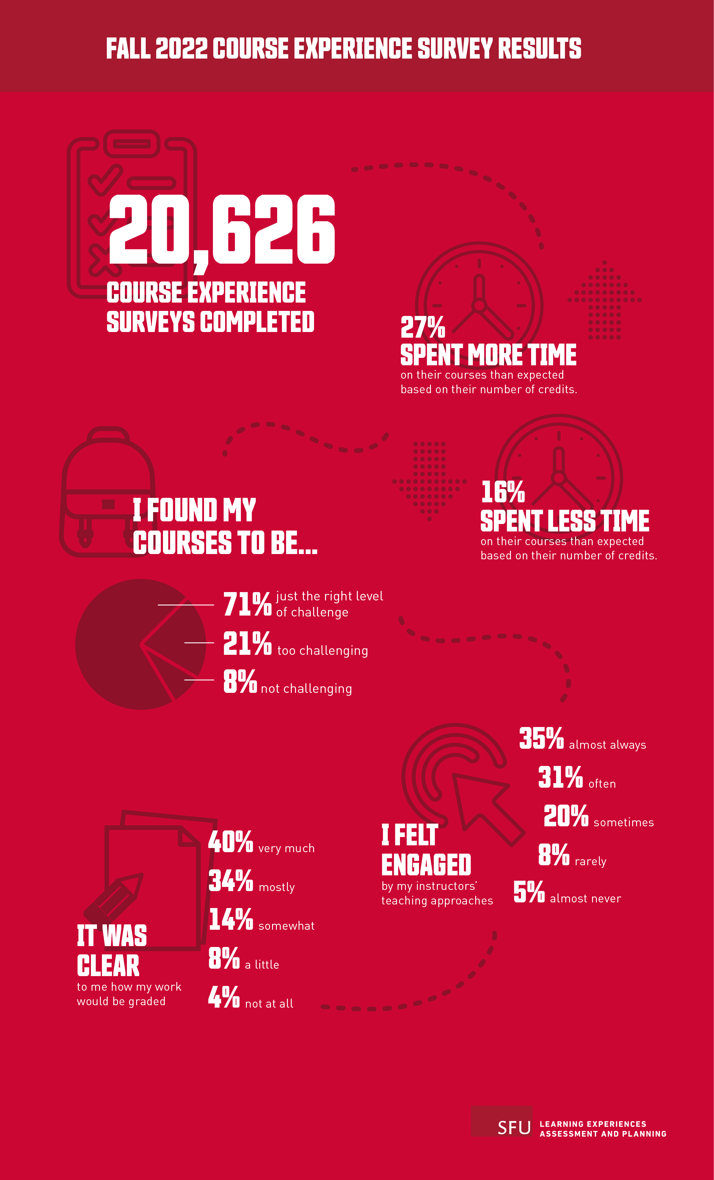
Infographic of key 2022 survey results
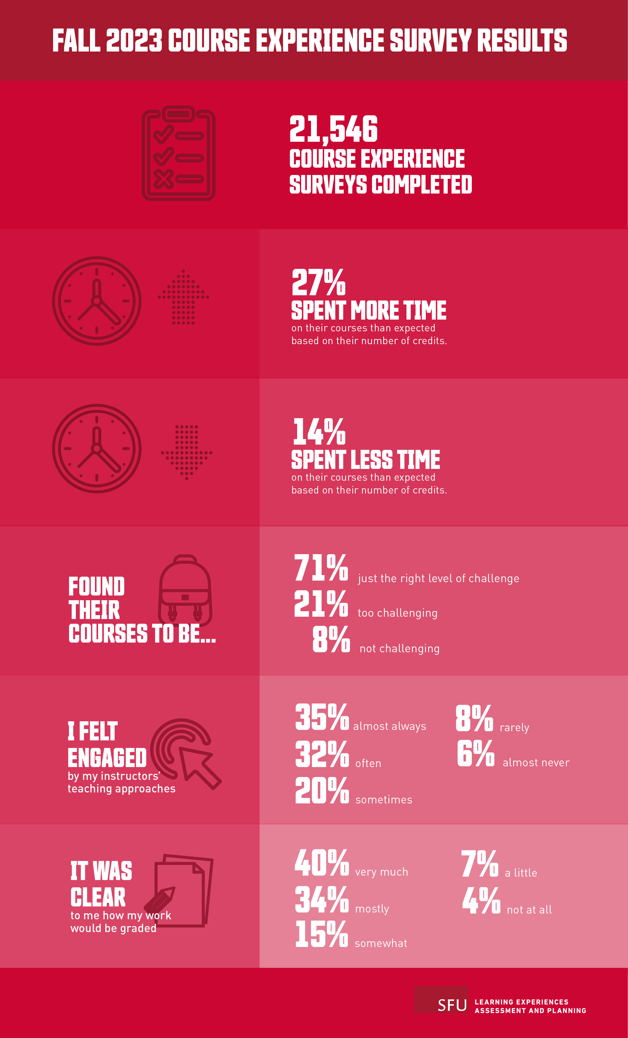
Infographic of key 2023 survey results
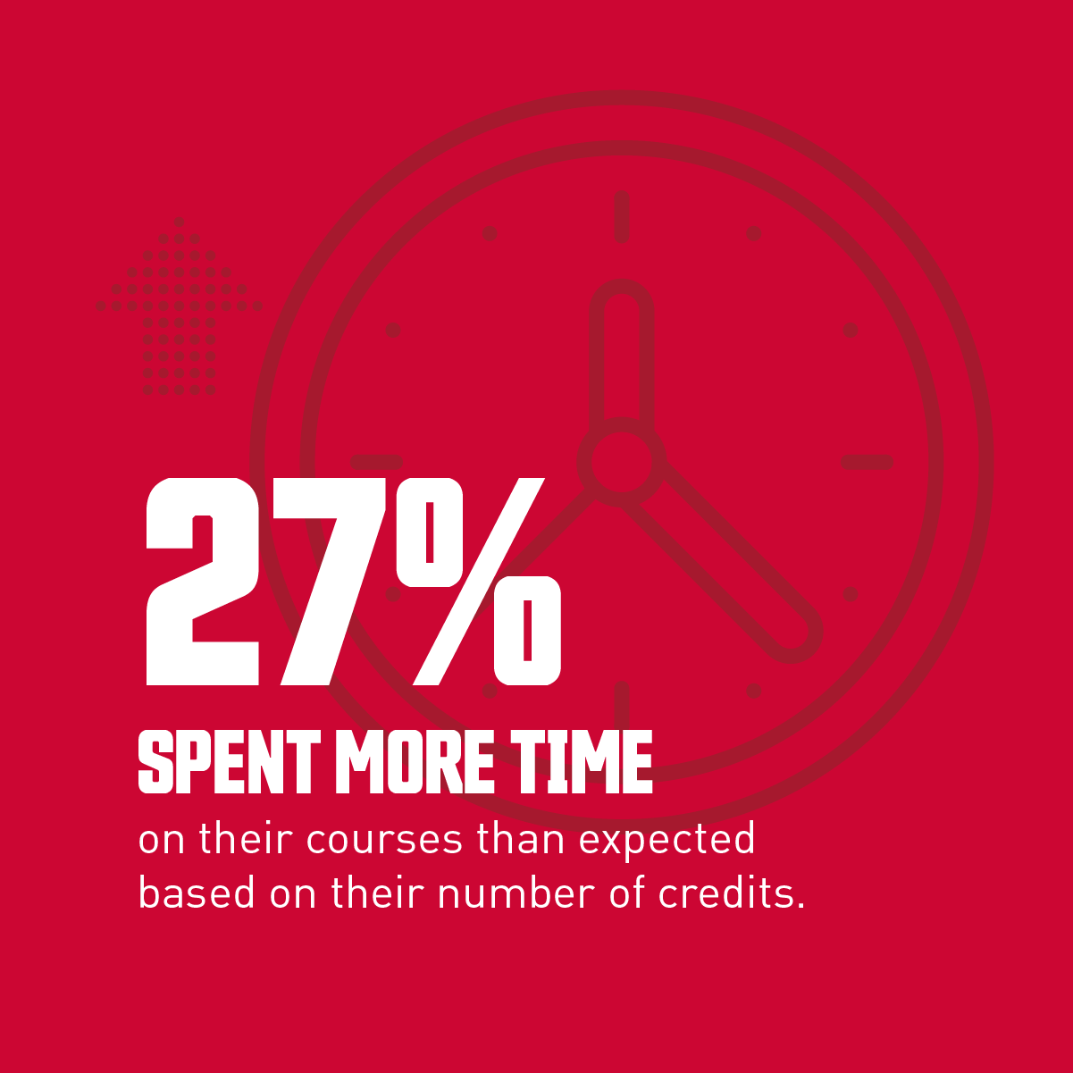
Key survey findings adapted into a series of Instagram posts
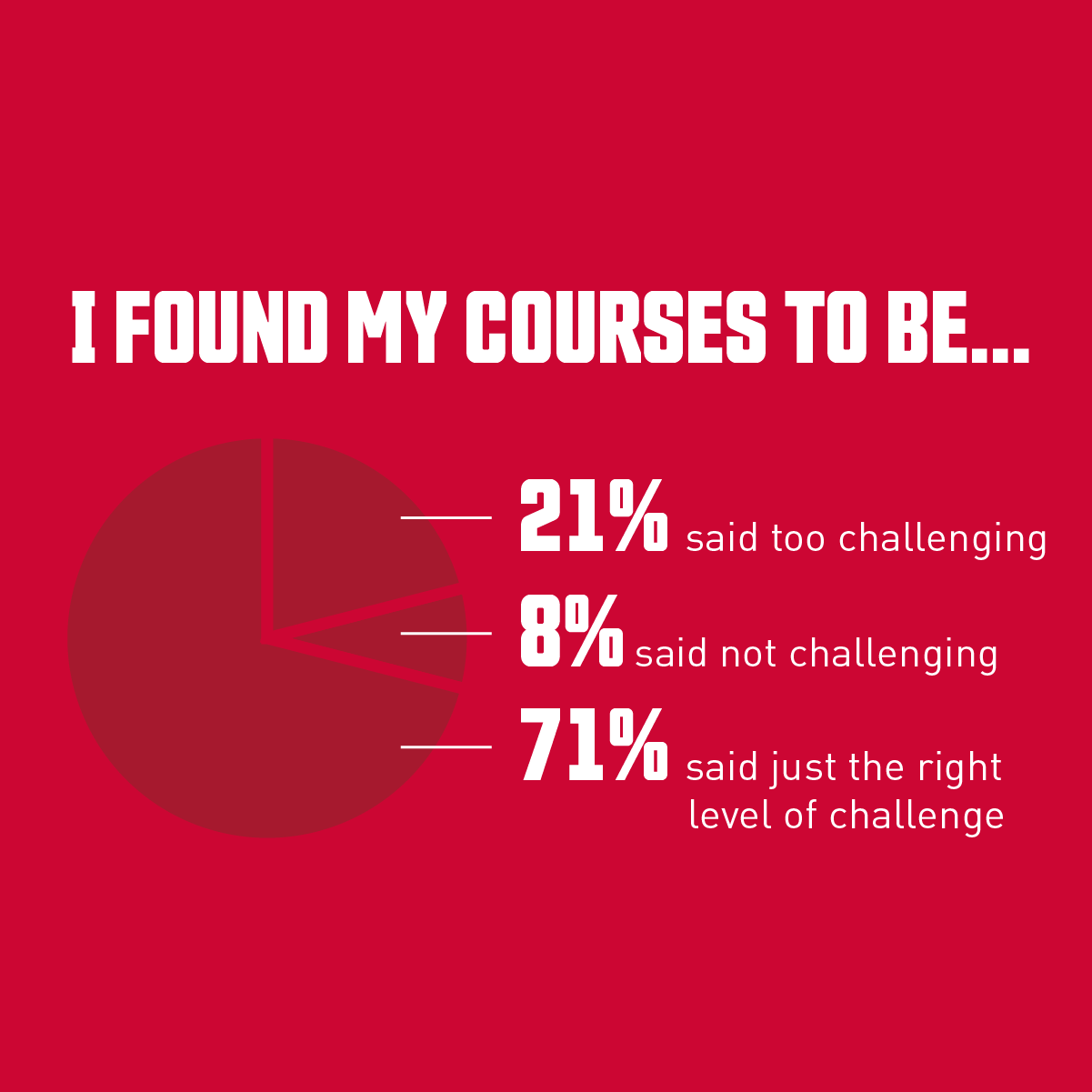
Key survey findings adapted into a series of Instagram posts
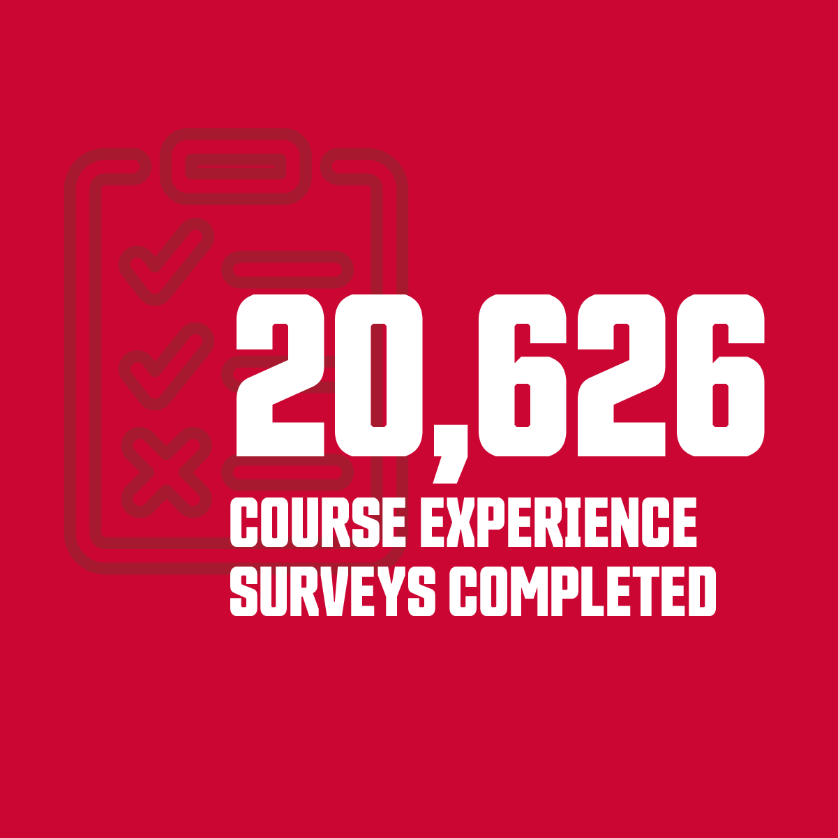
Key survey findings adapted into a series of Instagram posts